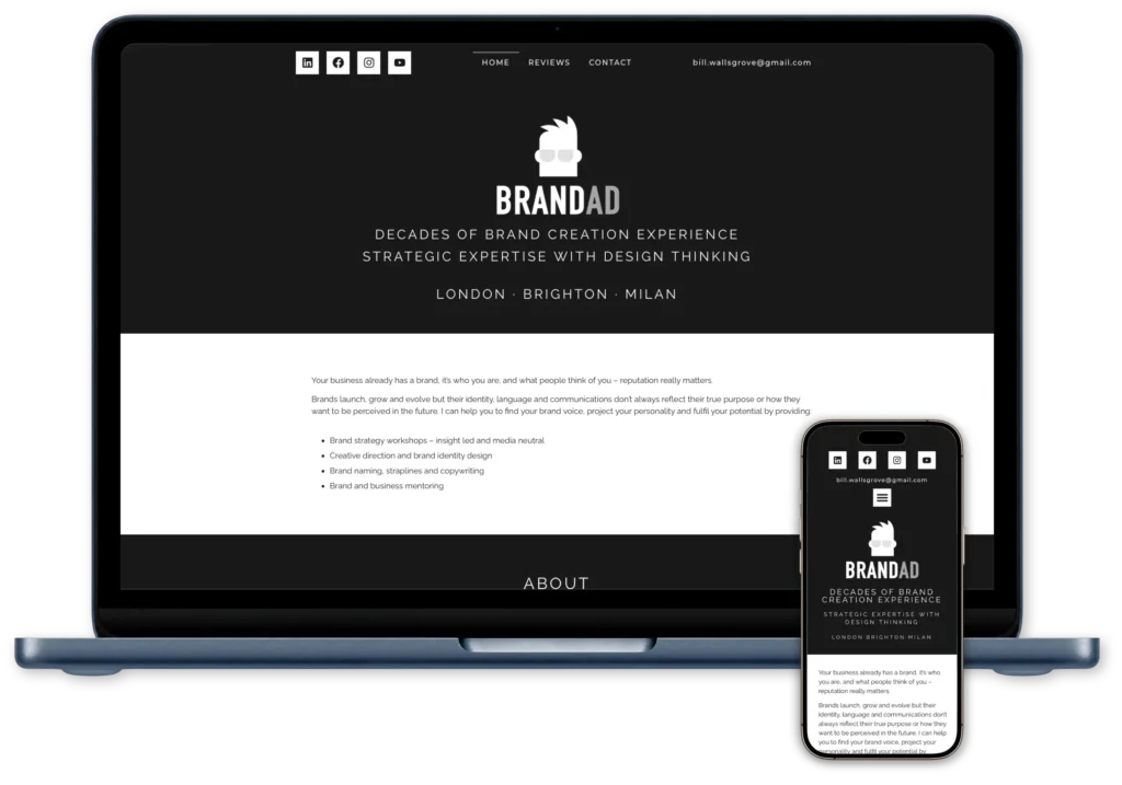
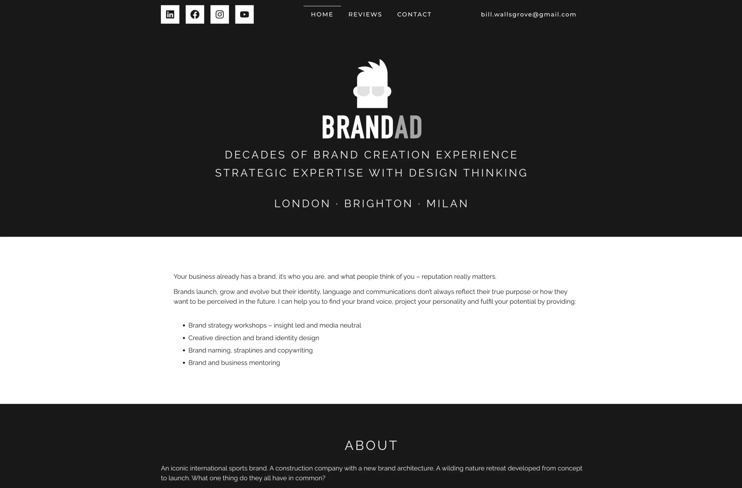
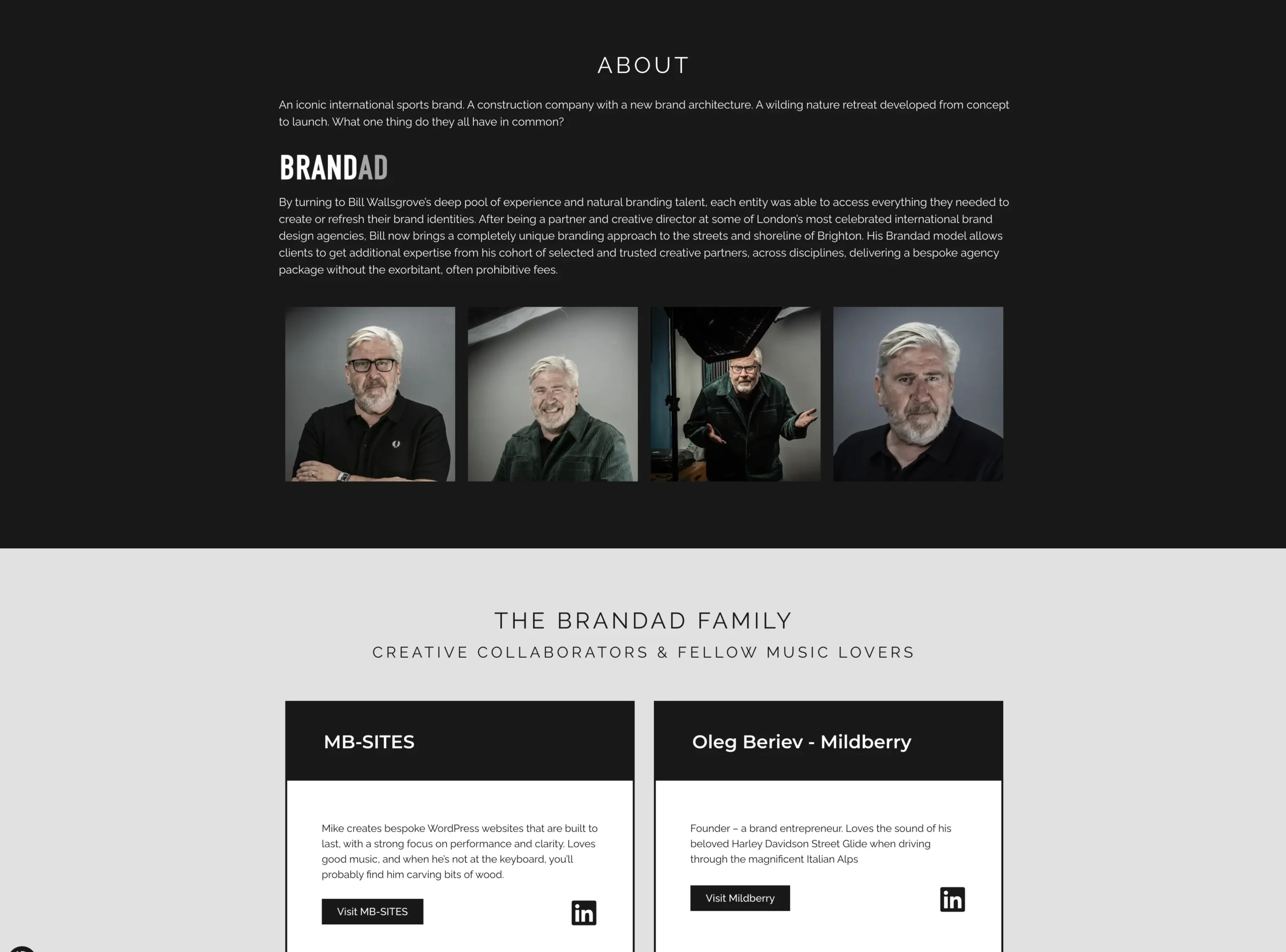
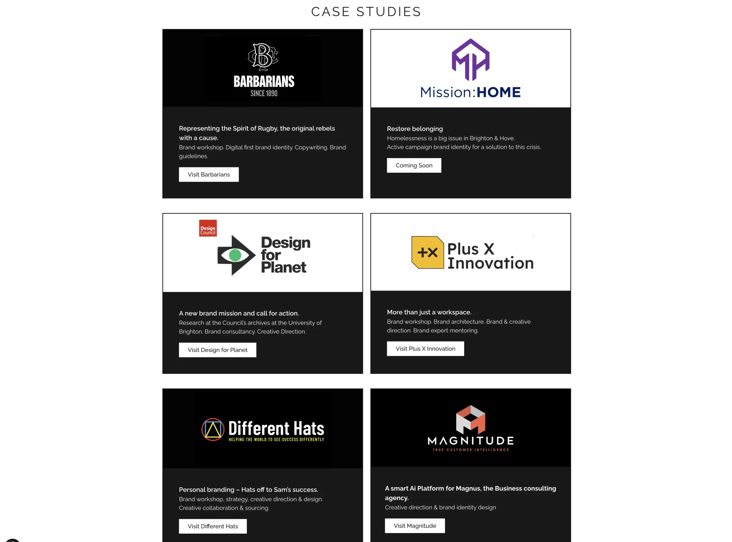
A bespoke WordPress website that translates Brandad’s distinctive identity into a confident digital presence, showcasing Bill’s expertise, collaborators and creative work.


We use necessary technologies to keep this website working. With your permission, we use optional analytics and marketing technologies. You can accept, reject or manage your choices. Privacy policy Cookie policy
Optional services: Google Analytics.
Required for the website to function and cannot be switched off.